CONTENT PRODUCTION
AND CURATION
This project aims to demonstrate a range of design tools to create visually engaging content.
This course explores the technical, social and ethical dimensions of producing and creating content to be shared and consumed online. Exploration of the varying modalities of communication is undertaken by looking at content through the phases of production, dissemination and consumption and exploring the impacts of this process on disciplines of creative arts and design.
Exploration of a variety of methods for producing, collecting, collating and curating online content is undertaken with the goal of working with a client to create a brief and then designing, curating and producing a product that is successful in meeting the clients requests by communicating and justifying each designs decision. The impact of technology on content production and curation will also be examined through out the process.
1533QCA


'The Gift' Template
Assessment Brief One
The Gift
Parts A & B: Project Overview
The aim of this project is to create 'The Gift' for our client. It is the designer's responsibility to curate and design the artwork that will be printed on a small box for their client.
This assessment is commenced by working with a client to co-create a brief that reflects their style, interests and personality. It is important make the client feel at ease when receiving a brief as this will allow them to open up to the designer. It is also vital to ask the right questions in order to establish the client's expectations for all aspects of the project from communication frequency through to conceptual designs.
Once the client's brief has been established and the return brief approved, the designer will commence curating elements for the product they will be producing. By using the appropriate design and communication tools the designer will them be able to conceptualise the design process and the product.
Through out the design process the designer will keep notes, sketch and reflect on their creative process, checking in regularly with the client to ensure expectations are being met.
The final product will be presented to the client in a professional manner, ensuring that it has met the client's brief and feedback has been considered through out.
Project Timeline

Client Brief
The Client: Brooke
WHAT ARE THEY STUDYING?
They have previously studied social work, and then business. Now the client is doing a Bachelor of Design with the hopes of majoring in Interior Design.
WHAT SORT OF AESTHETICS DO THEY ENJOY?
Minimalist, clean, timbers, plants, no clutter, linen
COLOURS THAT THEY LIKE
Earthy tones, white, blush, gold
PATTERNS THAT THEY LIKE
Herringbone
WHAT INSPIRES THEM?
Striving to be comfortable and self-sufficient
SOCIAL ISSUES THAT CONCERN THEM
Lack of excess, purposeful consumption, helping people, social work
PURPOSE
To keep jewellery in

IMAGES THAT INSPIRE THE CLIENT


Style & Theme Identification
Ambience Board

Return Brief
The Client & Her Style
Brooke is a first year design student with the hopes of pursuing interior design as a major and then a career. The interior style she most identifies with minimalism however her interpretation is largely different to mine. Brooke appreciates minimalism from an aesthetic perspective, she likes tone and texture with organic exposed materials and light simple colour schemes. The images she has provided are all minimalist in materially, not necessarily in placement or functionality. This shows me that the product that I am to produce focuses more on the texture of the objects, not the quantity and functionality as traditional elements of minimalism.
Design Response
In response to this interpretation of minimalism I have chosen to focus on the materials used to achieve the minimalist aesthetic rather than designing a simplistic space that fits within the traditional norms of minimalism. My concept is to create a discussion around the current trendy interpretation of minimalist interior design and show the darker side of what happens when a style separates from its original philosophy. The Gift I will be designing will not only highlight the aesthetic factors of the client's minimalist design style but also break down the resources used in order to create it.
My goal is to show that the form of minimalism that is commonly recognised by the broader interior design community is still harming environments and cultures and is significantly different to it's original philosophy.
The Concept
My concept for this project is to take an interior space and look at it from a perspective that prevents you from traditionally associating with its aesthetics. On the flip side of the box the same room will be visible in a deconstructed format with all the materials and resources used to create the space shown instead of the final product. The narrative of this gift will question whether minimalism is the process or the end result.
Design Tools
This project will be completed using three key tool. The space will initially be modelled in Sketch Up. Once approved by the client it will then be rendered using Podium and the final elements will be collated on the template in Photoshop and then printed and presented in a physical format.

Design Style & Philosophy
The Minimalist
The traditional definition of minimalism comes from the art form that rose to popularity in the post-world war II period. Similar to modernism, minimalism is characterised by it's simple forms. However, as the decades have progressed minimalism has grown into its own with unique elements and attributes that are easily identifiable. In the world of interiors minimalist spaces place an emphasis on the simple shapes, organic materials and neutral colours that make them. In graphic design, it is the use of space, balance and lines that attribute to this style. As an art form, it is the curves, the limited colour palette and the focus on empty space that define it. Out of these forms of creation, a way of life has emerged. This minimalist life style is one of simplicity, of a need for less, with and emphasis on the necessary and on the overall aesthetic; however, these elements are often lost in the in the search for the end result.
Is minimalism just popular because it is aesthetically pleasing to the eye? Is it popular because it seems safe and predictable? Is it popular because it is sustainable? Or in a world that is often viewed through the lens of social media, is this the style that is most palatable to the online eye?
A space that strives to appear minimalist often has a large history of consumption of materials, resources and time in its creation. This focus on the result of the space by the wider consumer prevents thoughts and conversations around the stories behind the style. In a style that promotes sustainability, purpose and functions, why aren't these elements reflected in its creation?
This begs the even bigger question...
Is minimalism the process or the end result?


Design Ideation
Concept Sketches

First Draft
3D Perspectives

Completed Design
3D Renders


Presentation
Slides

Presentation
Transcript
Hello, my name is Sophie and today I’ll be talking about my gift for my client, Brooke.
My brief from Brooke focused around her love of minimalism and natural materials as you can see in her inspiration images here.
After receiving this brief I decided to explore what minimalism means as an aesthetic in interior design and how this has shifted since it’s conception in the 1950s.
There are multiple definitions for minimalism however I chose to look at the one that related most to interior design.
Traditional minimalism is about lack of excess. This means that every object you own has a purpose and there is little room for additional consumption. Unlike most other design styles, minimalism is traditionally a lifestyle choice as well as an aesthetic.
Whilst we still see some elements of minimalism in the design style today, for example the limit colour palette and focus on the organic materials and finishes. Minimalism has become commercialised and therefore it has been separated from its philosophy.
Now a minimalist chair will be made from materials harvested, freighted and then shipped from Indonesia to be assembled and packaged in Thailand to then be freighted to another port to be shipped to Melbourne to be freighted to a warehouse to be repackaged to be freighted to the Gold Coast to meet all of the other minimalist pieces that have gone through a similar journey.
The issue isn’t that chair isn’t minimalist, it is that the journey that it takes is not.
In order to reintegrate minimalism with its philosophy, I believe that the definition of true minimalism should be changed to ‘a deliberate lack of excess in the process and result of decoration or adornment in style or design’.
A space cannot be defined as minimalist if the process used to create was not.
Every item in this space has travelled many hours and through many phases and hands to reach its next resting place. It has likely created enough rubbish to fill a hole the same size as the object and used enough energy in transport alone to create the product again. Sometimes we have to dig a little bit deeper in order to see this chapter of its journey.
So my gift to you, Brooke, is a thought provoking piece that asks you to consider where every element of your designs comes from on your journey to becoming an interior designer and creating gorgeous, functional and ethical spaces.
Thank you.


Project Reflection
On My Product
I believe that a designer should never give their client exactly what they want. It is your role as a designer to use your experience and expertise to extend upon the project and brief provided to you.
For this project, I took the clients brief and the aesthetics and styles that she likes and unpacked them to reflect her social consciousness. I worked to the clients brief by building a 3D concept of a lounge room in Sketch Up that reflected the images and style she preferred. I chose to take the perspective of look from above to make the viewer work harder to interpret different elements of the space and capture their attention for longer. I also wanted to create a gift that was more than just a pretty box so I chose to create something that was thought provoking and confrontational on the reverse side of the box. By deconstructing the room and filling it with all the resources used and waste produced in its production I hoped to highlight that every space creates has an impact beyond the end result.
I'm really proud of my design for the gift as I feel it serves a greater purpose beyond just meeting the client's brief. I feel that this project has given me a great opportunity to utilise and further develop my design skills whilst delving into research and design theories that deepen my understanding of content in the context of this project. I feel like this design is a representation of the best of my abilities at this point in time and I really enjoyed exploring it through multiple lenses. My hope for this gift is that it inspires my client to not only create beautiful, functional and ethical space but also to think deeply about the spaces she create in her design journey.
On My Presentation
There are a few reasons why I chose to present my packaging design in person rather than as a video. Firstly, I had already done a video presentation recently for another course and I felt that I should work on my in person presentation skills for this one, secondly I believe that people are more likely to listen to you if you are speaking directly to them, rather than through a screen.
I think that I could have further justified my design choices in response to my brief however this was difficult given the two minute time constraint around the presentation.
I enjoyed exploring the meaning and theory behind my client's design style and being able to share that in the presentation added an extra layer of challenge.


Assessment Brief Two
Digital Diary
The purpose of this digital diary is to document my process for assessment on in creating 'the Gift' (see above). I will also be exploring the content that is the focus of each week's lectures and reading and critically reflecting on each of these topics. Additional content will also be produced to show an understanding of the content. I have chosen to this predominately through academic journal article and books as I have been doing a lot of reading through out this course on the areas that interest me most. I have also included imagery and sketches to support some of my discussions.
Each week I am also assessing what I took away from the content, what I learnt and how this will influence me as a designer.
Lecture Reflection
Module I
Managing the Project
CONTENT CURATION
Curation is the careful analysis and selection of what to add in and what to remove from a collection and then to present this collection in a way that appeals to your target audience.
As designers, there are two key areas where content curation skills are imperative. Firstly, by curating our personal image, brand and online identity we are able to attract clients through the use of a portfolio. The other area where content curation is imperative is within the design phase itself. When you design, you are not only creating something new, you are also sifting through ideas, concepts and creations in order to communicate your designs with your client.
As curators, it is important to critically reflect on the content you have produced and curated in order to assess why it has been done this way and what could have been missed.
THE DESIGN BRIEF
Design briefs come in all shapes and sizes, from a few quick words on a phone call to a long detailed list of needs. Receiving a design brief from a client is imperative to the design process as it highlight the client's expectations from you through out your collaboration. A design brief ensures that the designer has a clear understanding of the requirements and parameters surrounding a project. A return brief is the designer's response to the client's brief. A return brief ensures that the designer and the client are on the same page.
PROFESSIONAL COMMUNICATION
As a designer it is important to remember that you are the one that sells your designs and your communication style can influence how your client perceives you. Simple things like proof reading emails, respectful conversations and a well presented appearance (online and in person) are all ways you can curate your professional identity and communication style.
I believe that there is a lot to be said for creating an open and more laid back communication stream with a client as this can lead to greater collaboration and honesty. However, this is something that comes with time and development in the designer client relationship. In these circumstances I believe that it is appropriate to relax the communication in the interests of creating a more honest and open relationship.
Personal Reflection
Module I
Introduction to Content Curation
This week we explored the basics of managing a project and how to get started. The element that I took away was the importance of digging a little deeper in your client's brief to find ways to add extra value and meaning.
I learnt that the design industry is constantly adapting and changing and this will influence me to be a designer who is able to do this by independently seeking out additional knowledge and working to develop new skills.
Lecture Reflection
Module II
The Digital World
TECHNOLOGICAL ADVANCES
It is important to keep abreast of the technological advances in the design industry for a number of reasons. Firstly, it allows you to stay relevant and competitive. Understanding what is on the forefront of design will put you ahead of everyone else who doesn't; and being able to implement these advances in your own work. There has never been a generation more susceptible to changes in technology than Generation Z.
Another reason it is imperative to stay at the forefront of technological advances in the design industry is that they can offer you the opportunity to design better, faster, more thoroughly and with purpose and tangible result. Before Photoshop and Illustrator, advertisers would draw, print, cut and assemble each page of copy by hand; today an ad can be done in minutes.
The last reason keeping on top of tech advances is so important is it gives you the opportunity to change how you work. Technology has allowed us to shift how, where and when we work and at the end of the day, your lifestyle is just as important as your career; why not ensure technology is allowing you to live your life to the fullest.
ETHICAL CONSIDERATIONS
A filter bubble is the space you interact with on the internet that is tailored to you specifically based on your previous search patterns, computer usage and interests. Algorithms in search engine and on websites monitor how you use systems and show you information that they believe is most interesting and relevant to you. Whilst this is a clever marketing technique and increases the ease of user experience, there are some ethical considerations to take into consideration. The journal article 'Ethics of Personalized Information Filtering' by Ansgar Koene et. al. discusses the issue of creating a feedback loop in which the algorithms only show information that relates to their interests, no longer exposing them to new or updated information. This also means that new content that is produced is only going to those who are already interested in the topic the content is about. This means that the audience stays the same, likely becoming over saturated with the same information.
'Serendipity by Design? How to Turn from Diversity Exposure to Diversity Experience to Face Filter Bubbles in Social Media' by Urbano Reviglo points out that the online content that creates filter bubbles is often driven by design choices, this means that as designers we have to remember our responsibility for the content we create and curate and how users interact with it.
Out of curiosity, I took a more in depth look at the advertisements I receive on Facebook. I receive lots of ads for holiday packages (probably because I'm often on flight centre), fashion (I'm guessing this is due to my age) and deals to promote business content on other social media sites (presumably because I look after our digital presence at work).
COPYRIGHT AND IP INFORMATION
The Australian Government provides guidelines and legal frameworks to protect all the content and design that you produce. Most design works are protected under copyright laws for the duration of your life plus seventy years, this excludes your business name, logo and slogan which are trademarked and can be renewed every ten years.
In order to ensure that your designs are protected they need to be registered with IP Australia, with the registration lasting for five years before needing renewal.
In my own work, as it is continuous and progressive, I put a small copyright and disclaimer at the bottom of all my plans to ensure the the content I'm producing for my clients is protected.

Personal Reflection
Module II
How Our Digital World Shapes Us
I believe that living in a technology driven world is an amazing time to be in, as long as you are in control of how your information and content is shared. This module taught me that it's important to make sure your work is protected whilst also respecting the ownership of work produced by others. There is a fine line between inspiration and plagiarism and as content curators we have to learn to walk it.
I thought that the focus on copyright through the lense of Ingenious Australians was a really worthwhile exercise and should be more widely known. When I was in High School I was lucky enough to spend some time in Central Australia working with the Pitjantjatjara indigenous community and gaining a greater understanding of their knowledge. This opened my eyes to another world and allowed me to really understand how Indigenous cultures share and interact with their history. This experience allowed to understand that even if someone shares a part of their culture with you, it is not then yours to share with others.
I have some gorgeous images of me spending some time with the elders there however I know that one of them has since passed away so out of respect for their culture I can't share the images here.
Lecture Reflection
Module III
Rethinking Aesthetics
The traditional definition of aesthetics is 'concerned with beauty or the appreciation of beauty' however I inherently disagree with this as the concept of beauty is purely contextual. I believe that something can be aesthetic without being beautiful. Aesthetics are relative to our individual cultures and experiences and can be influenced by our upbringing, memories, and social circles.
There are few interpretations of the principles of design, in this course we are following:
-
Balance
-
Proximity
-
Alignment
-
Hierarchy
-
Repetition
-
Contrast
Some academics believe that emphasis, variety and movement should also be included should also be included, however I believe that these additional principles are subjective don't apply to every 'good' design.
The elements of design are:
-
Line
-
Shape
-
Direction
-
Size
-
Texture
-
Pattern
-
Colour
These are all much more standard across the design sphere however there are some instances as sometimes pattern ends up in the principles instead of repetition. I believe that it is more important to understand the core concepts that these represent and implement them rather than seeing them as a tick list that needs to be checked off in order to create successful and appealing content.
I believe that aesthetics are vital to design. As much as I would like to say functionality should be the focus, aesthetics is what draws the human eye in and it is ignorant to say that they are not important. The aesthetics that I find most appealing are those that are cohesive and demonstrate a layer of meaning or extra thought. I love images, spaces and objects that make you feel something.
Working in the design industry I often come across people who's interpretation of an aesthetic or a style is different to mine. Asking questions and showing imagery is a key part of understanding someones aesthetic. I often find that a client might show me an image that is a completely different to the style we had previously discussed but when I dig a bit deeper they might just like the chair or the light fixture in the space.
In relation to this project, I have had to shift how I perceive minimalism as a philosophy and an aesthetic in order to interpret how my client sees it. For example, I believe true minimalism is reflected in other aspects of your life, beyond an interior design style.
The importance of form in relation to function is incredibly subjective. As a designer, I believe that they are equal and should be harmonious. Form and aesthetics are used to draw the eye in, engage the user and keep them interested and function gives purpose to the creation and without a purpose, then what's the point of creating?
I have synesthesia which is when a person perceives a sense that is simultaneously felt by another sense. I'm my circumstance I associate certain letters, words and sounds with specific colours and tones. This has given me a subconscious fear or disassociation with colour either on my person in within spaces that I regularly inhabit. This aside, I always try and put myself in my client's shoes to understand what they like or dislike. I believe that colour has an incredibly important place in the world and it is transient and subjective as times and trends change.
As my client prefers a minimalist aesthetic I am introducing colour more in the form of natural textures like plants, timbers and concrete in order to create a light colour palette. On the reverse side of the box where I am doing the deconstructed space, I am using a lot more colour to highlight the contrast between the two spaces.

Personal Reflection
Module III
Aesthetics and the Principles of Design
Prior to doing the readings for this module and reading my own books, I did not consciously realise that Western culture has such a strong aversion to colour however now I'm seeing this reflected everywhere; in the colour schemes for new developments, in the design of government websites and documents. A classic example is Henry Ford refusing for years to realise his cars in anything other than black. This module has made me want to use colour so much more in my own work.
Lecture Reflection
Module IV
Aesthesis & Decolonisation
Living in a country with a strong colonial history, it is impossible to escape colonial impacts within our Australian society. Colonialism is everywhere from the education systems we learn from to the clothes we wear. In order to restore the systems that existed prior to colonialism we must work with these cultures in consensual and ethical manner in order to avoid cultural misappropriation. It is a fine line to walk however, I believe that if we don't do it then we are missing out on thousands of years of knowledge, history, experiences and opportunities. Imagine the designs that could be created in collaboration with so many voices that have previously been stifled.
I want to be an ethical designer, with all the elements of sustainability reflected in my work were possible. For me this means not just being environmentally sustainable but also, politically, economically, socially, technologically, and legally. After completing this module I also understand that I need to add culturally sustainable to this list as well.
Australia is an incredibly rich and multicultural country so I believe that it is almost impossible to just work with people who come from the same cultural backgrounds as you. As a designer, I believe my role is to be the voice and expression for people who don't have the same design skills as me. I stand for honesty and transparency between the client and the designer, quality research and active discussions between the working group in order to gain a deeper understanding of the cultures.
Personal Reflection
Module IV
Aesthesis & Decolonisation
The reading that we completed in module two, 'Indigenous Cultural Protocols and the Arts', really resonated with me as a guideline for the ethical boundaries that I will set for myself as a designer regardless of the project I am working for. I want to be able to reflect on the questions posed in this reading and use them to guide my decision making as a designer.
My commitment to educating others about asthesis, decolonisation and ethics is to always embed a thought provoking element in my designs that questions how and why certain representations are presented in our culture and society. I believe that I have embedded this mission and message well in my design of 'the Gift'.
A quick side note: This is probably a good time to mention that all the images used on this page are found on Unsplash, a site that obtains images with the consent of the photographer or artist who produced them and allows you to use them for free.

Lecture & Personal Reflection
Module V
Reflective Design Practice
Actor network theory applies to my design because there is an interaction between all the elements of the design, from the tools used to create it, the designer, the product itself and the client. Each of these elements it continuously impacting each other and the world around us. If I was to put my interpretation of this simply I'd say 'everything we design, designs back on us'.
I love that their is a trend and shift towards more work in the digital sphere. My hope is that this will one day allow me to work from anywhere. I think that the interconnection of the global market place is a really positive thing as it allows for greater sharing of information, skills and research. I look forward to being able to work with people from all over the globe and being able to see the opportunities that this could bring.
I live and work 45 minutes away from home so I spend a lot of time in the car thinking. I tend to have a lot of good ideas in this environment because I am relaxed and doing something menial and simple. I often found that ideas come to me when I'm doing everyday things that utilise the primal part of my brain, like showering and laying in bed.
My idea for 'the Gift' came when I was driving. I was thinking about how my client's interpretation was incredibly different to mine. I had recently watched a documentary about the philosophy of minimalism and wondered if I could find away to question the interpretation of the style. The final design stemmed from this.
I always start my ideas with a basic sketch mainly to get the ideas out of my head and to figure out purpose and composition. I would love to have the time to do more physical sketching however I'm much quicker at creating digitally.
This course has taught me that I really value putting meaning and thought into the work I do. I like challenging the norm and embedding sustainable and thought-provoking elements into my work. This is definitely something that I want to make an effort to integrate into my work outside of university.
If I was to do this again I would do more concepts, I think it would've been interesting to see this design as a series completed with different spaces through out the 'minimalist' home.
I want to be an ethical designer, with all the elements of sustainability reflected in my work were possible. For me this means not just being environmentally sustainable but also, politically, economically, socially, culturally, technologically, and legally.

Course Reflection
Feedback
I didn't get to complete the feedback form as they always expire before I get the chance to sit down and complete them (they really need to leave them open until after exams) however I wanted to give feedback on this course anyway.
I really enjoyed this course, I found the content to be incredibly engaging and it really made me consider each part of the design process along the way. I feel like the content was really relevant to what is going on around me right now and I hope that it keeps getting updated for future years.
My tutor, Salvador, did a great job of encouraging students to progress their work one step further, regardless of the level they were at. His critical reflection on the work the students did was also really useful, relevant and thought provoking.
I think it would've been great for each persons client to give feedback on their box at the end of the presentation in order to assess how welly they had met the brief.
I thought this course was incredibly relevant and useful and it has given me an excellent understanding of design processes, ethics and sustainability. These are elements that are really important to this industry and often don't get a lot of air time. It has also given me the chance to add a great element to my portfolio that showcases my skills as a designer.

Reading Reflection
Module I
Seven Tips For a Return Brief
Eco Design's 7 Tips for a Return Brief explores the steps that can be taken as a designer to respond to a client's project brief.
1. UNDERSTAND THE BRIEF
Receiving a brief from a client it is important to not only understand their explicit requests but also their implicit assumptions and elements that may be impacted by their cultural beliefs. As a visual person, I find that Edward T. Hall's 'Cultural Iceberg Model' clearly demonstrates the elements which are easy to identify and the ones that are more difficult to see.
2. ANALYSE NEEDS
Once you have received the client brief, it is your role as an adviser to analyse what the client perceives their needs to be and find ways to meet them with sustainable practices.
3. DEFINE PROBLEMS
Making client's aware of potential problems and showing them examples of these will assist in defining the constraints and expectations for the project. This also stimulates problem solving from the user side, not just the designer side and can lead to more amicable outcomes.
4. DESIGN RESPONSES
Design responses are the solutions to the problems that you have defined. It is our role as the designer to solve these problems with creative and viable solutions and foresee any potential risk or reward.
5. PROVIDE OPTIONS AS ADDED VALUE
Give the client more than they expect. By providing the client with a single option that is exactly what they want, you box yourself into one specific way of doing things. Extend upon this by providing alternative options that extend the design beyond the client's initial requests. I believe that it is your responsibility as the designer to show the client how to be more adventurous.
6. APPROPRIATE COSTING
In most cases costing is the biggest constraint on a project, and this can prevent the realisation of the full vision. By offering the client a 'life cycle cost' as well as an initial cost they are able to perceive the long term benefit that your design will provide. This allows client's to perceive their costs in comparison to the life of the product that you are designing.
7. BE CLEAR, CONCISE BUT COMPREHENSIVE, ON TIME AND DO WHAT YOU SAY YOU WILL DO!
I believe that this tip speaks for itself.
Reading Reflection
Module I
Keynote Empowering Learners with Digital and Media Literacy
This article by Renee Hobbs discusses how learners can be empowered with digital and media literacy by teachers and librarians who have the skills to do so. This is an interesting approach to learning in the digital sphere as it begins with a human centred approach with students learning directly from the teacher and not through a digital interface. This text shows that in order to operate in a digital space it is important to understand that it should be harnessed as a tool for learning. To do this, learners must know how to search for the correct information and decipher the information they receive to ensure that it is relevant and credible.
The element that I took away from this text is the three questions that Hobbs uses to judge the credibility of information: Who's the author? What's the purpose of this message? How was this message constructed? In a world that is saturated with opinions that are often misconstrued as fact, is is important to have the skills to dig a little deeper and discover true meanings for yourself in order to make informed decisions.
Reading Reflection
Module II
“We shape our technology; then technology shapes us.”
In the article, Sarah Drinkwater discusses the positive solutions to fixing the tech industry and turning it into an ethical landscape for the future.
As we all know, technology has had some unexpected and negative effects on our lifestyles and the wider society, especially in the online sphere. However, the element in this text that stands out the most is its focus on solutions and the benefit of fixing the tech industry. In an incredibly concise text, Drinkwater addresses many key issues that are currently facing the tech industry from business structure to how the next generation is learning. I agree with Drinkwater that in order for things to get better a holistic approach must be taken. By beginning with education, the next generation of designers and tech entrepreneurs with have the skills to make ethical decisions around what and how they produce. Ensuring that tech teams are made up of people of different genders, races, upbringings and education systems is another key factor in ensuring that tech works for everyone, not just the select people currently creating it.
The video game development company Valve is a perfect example of a tech company that has shifted how they structure their workplace. Valve has no direct hierarchy system in place and this presents a unique and specific issue. Groups known as ‘cabals’ are formed within the company based on peoples interests and skills. A leader then emerges from the group as they begin working on a project (see my sketch below). This system can be incredibly effective when working in a creative industry, however it is important to consider personality and cultural clashes within a workforce such as this.

Reading Reflection
Module II
Indigenous Cultural Protocols and the Arts
This article explores the protocols that protect Indigenous Cultural and Intellectual Property. These were produced by The Australia Council for the Arts in order to explain the legal, ethical and moral issues that should be taken into account when artists draw on Indigenous cultural material in their works. In the political and social climate that w currently exist in, I believe that this could not be more important.
The article poses questions that should be considered by a practitioner when developing relating to the following list of principals:
-
Respect
-
Indigenous Control
-
Communication, Consultation and Consent
-
Interpretation, Integrity and Authenticity
-
Secrecy and Confidentiality
-
Attribution and Copyright
-
Proper Returns and Royalties
-
Continuing Cultures
-
Recognition and Protection
To me these principles are ethical guidelines that should be discussed more as there are so many layers of content creators that would benefit from this sort of reflection and questioning. I believe that these are incredibly important principles to apply to your design regardless of what culture you are working with.
I appreciated that these protocols encouraged non-indigenous people to work with indigenous creators as I believe this is incredibly important to gain cultural understanding and share knowledge.
Reading Reflection
Module III
Chromophobia
To define it simply, chromophobia is the aversion to colour. However the roots of this fear run deeper than just not liking the colour red. In the book 'Chromophobia' by David Batchelor, he discusses the unique cultural responses to colour that dictate our associations to them. In the western world our associations with colour stem from the artistic interpretation and portrayal of children, femininity, and oriental cultures. Colour has been purged from society in two ways. Firstly, by linking it to people who form societal minorities (women, children, the oriental and the queer) colour is associated with a foreign body. The second purging is the association with the superficial (the cosmetic and the unimportant). Batchelor defines serious art culture as being perceived in shades of grey and with line and tone.
In the book 'The Secret Lives of Color' by Kassia St. Clair she discusses the different cultural and historical associations people have experienced with colour. St. Clair highlights that there is a dislike of colour in the western world as many classical writers viewed it as a distraction from the true elements of art: line and form. I have been reading this book over the course of the term and have found that it links well with this module.

Reading Reflection
Module III
Bubbles, Lines and String
This reading Peter Hall discusses and provides examples of how visual representations of data shape our society. Hall's article identifies that the majority of Journalistic representations of data just provide a visual overview of a situation and does little to dig below the surface and look at the causalities and impact of it. In comparison, science spends more time looking at the why and how and less time representing their findings in a transparent, visual and easily digestible way. Hall identifies that both parties have a lot to learn from each other and I couldn't agree more.
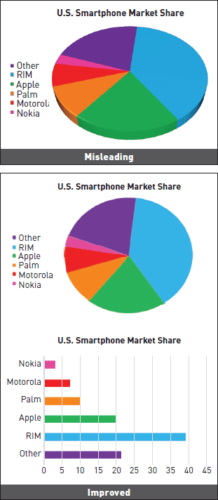
I believe that article should also offer an opportunity to discuss how the design of graphs can change how information is perceived. In her article The Good, The Bad and the Biased: Five Ways Visualisations can Mislead (and How to Fix Them), Danielle Szafir identifies how design principles and elements are used to create data bias when representing information. The graphs below use the design principle of alignment and the element of shape to distort information in favour of a specific product or viewpoint. This is an unethical example of how design principals can be used to your advantage and the impact that the can have on the representation of information.

Reading Reflection
Module IV
Decolonial Aesthetics (I)
Decolonisation, as interpreted from this reading, is the practise of removing colonialism form cultures that were squashed by it and restoring their systems, histories and practices and encouraging them to flourish once again. Decolonisation is about shifting the racial, sexual, national, linguistic, religious and economic hierarchies imposed by the colonial world.
I believe that this reading indirectly highlights that there is a great amount of value that can be found in the knowledge that has been suppressed by colonisation. For example, if we were to look at our current education system born out of the colonial industrial revolution. Current education is very much centred around creating employees who can follow systems and rules. If we were to embed the Indigenous Australian way of learning in our education system, we would be encouraging like creativity, self-direction, adaptability and tangible learning in nature. These are all elements that are currently lacking in the system imposed on us by colonialism and are needed to create the next generation of thinks and designers.
Reading Reflection
Module IV
Avoiding Misappropriating Indigenous Cultural Heritage
This article is similar to Indigenous Cultural Protocols and the Arts' that we explored in module two. However, it explores working with ingenious people in a broader context, not just with the goal of creating art and design. This article identifies the guidelines of working with indigenous people as:
-
Rights, respect and recognition
-
Negotiation, consultation, agreement and mutual understanding
-
Participation, collaboration and partnership
-
Benefits, outcomes and giving back
-
Managing research: use, storage and access
-
Reporting and compliance
The article defines misappropriation our cultural appropriation as one group benefiting from the culture of another with permission and compensation. It is identified that often misappropriation occurs through the label of a tribute, promotion, acknowledgement or influence however this is questionable as without proper informed consent and the involvement of Indigenous people who's culture and heritage it is, as it is likely for some sort of personal gain.
The message that is driven home by this piece is if you are not working with people from the culture you are hoping to represent to achieve a consensual outcome, then you're probably misappropriating someones culture.

Reading Reflection
Module V
I [heart] Sustainability: Because Necessity no longer has Agency
At the time of writing this reflection I am witnessing climate marches take place all over the globe, I'm watching students skip school to protest and grown men take to twitter to abusive and discredit a young girl who has become the face of this movement. This article could not be more relevant.
The key element that I took away from this reading is that sustainability is currently viewed as a sacrifice. It is portrayed as a solution that will make us miss out on things that we value and enjoy. Sustainability should be looked at as an opportunity to create a better world in all industries.
Enviro Development has a great training program and toolkit that they offer developers that assist them in creating more sustainable developments by meeting certain criteria under the following elements:
-
Ecosystems
-
Waste
-
Energy
-
Materials
-
Water
-
Community
These kinds of initiative give industries the opportunity and tools to create more sustainable world and to start viewing sustainability as exciting, necessary and revolutionary.
Reading Reflection
Module V
Making the Social Hold: Towards an Actor-Network Theory of Design
This article discusses how objects we design then impact us and the world around us, whether these impacts are intentional or not. When designing it is important to observe the predictable results of its creation but it is also imperative to take a step back and reflect on the elements and occurrences that were unexpected and whether they positively or negatively effect the world around them. By viewing these problems through a variety of lenses (sustainable, cultural etc.) we have the opportunity to solve further problems that design may cause.
I have always thought that the door knob is the most discriminatory form of design. It requires a hand with all fingers to use it to open a door, thus making it unusable for a large group of people; children, the disabled, the elderly, people carrying things, people with wet hands... the list goes on. This is the perfect example of an object that has been designed with good intentions but now designs negatively back on a large group of people who use it.

Reading Reflection
Module V
Our Future World: Global Megatrends that will Change the Way We Live
Wow, the future is exciting. This article was by far the most eye opening to me as it presented so many elements that I know and experience now, however have never really thought about as great societal shifts.
MORE FROM LESS
As finite resources are used up and the population grows, we have to adapt to create more from less. This means more food from smaller farms and more people living in smaller homes. This presents the opportunity for so many design solutions and an incredibly sustainable future.
GOING, GOING... GONE?
It is well known that many species are going extinct. This mega trend highlights the current state of the world’s ecological habitats and biodiversity. I like that this was posed as question, it puts a positive spin on what is often told as a sad story with no hope.
THE SILK HIGHWAY
World economics is shifting to Asia and poverty is decreasing with an emerging middle class predicted to arise from Africa and South America. To me this is perhaps the most exciting mega trend for Australia as it has a large decolonial aspect. With the quality of life increasing in these countries, so too will the access to new ideas and ways of thinking.
FOREVER YOUNG
With health care increasing, an ageing population is a megatrend that is very real in Australia. This will shift when and how people retire, the responsibility governments have for pensions and the pressure we feel for preparing for the future.
VIRTUALLY HERE
How we work is shifting. Already we are seeing global companies, national teams and more freelances. With global connection we have access to skills and talent like never before.
GREAT EXPECTATIONS
This megatrend sees a shift towards more personalised services and the want for experiences over consumer products. People will expect better quality products, services and experiences. Being in a service industry, this is excellent news for designers.